back
Context
Research
Non-goals
Insighs
Solution highlights
Live
Takeaways
Final thoughts
product
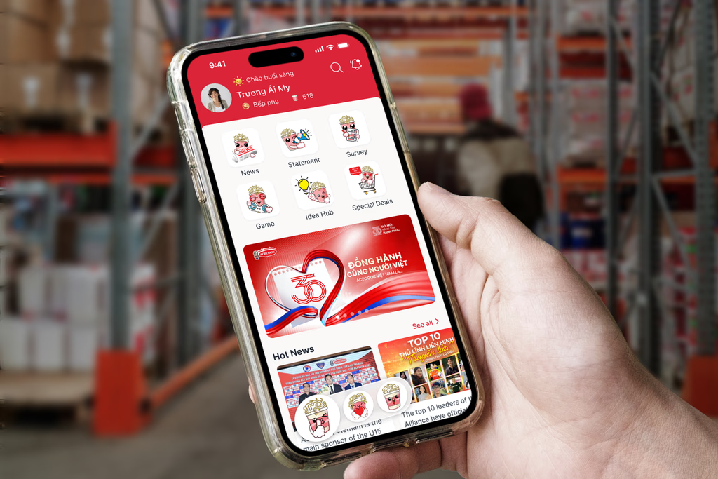
Acecook Home: App Redesign
PROJECT
Internal App
TIMELINE
May–Dec 2023
8 months
role
UI/UX Designer
Team of 2
SKILLS
Interaction Design
Visual Design
Why this project exists
The old app stopped being useful
Acecook's internal app no longer matched how employees actually worked. The fix wasn't just cleaning up usability. It was making an app people would choose to open every day.
RESEARCH
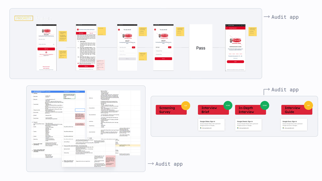
Acecook gave us research and a feature list, we verified it with our own audit
Acecook handed us existing research along with a list of features they wanted, similar to a brief. Office employees opened the app regularly. Factory-floor employees barely did. Acecook wanted that gap closed, not just the interface polished.
We didn't stop there. We ran our own audit of the app and talked to a handful of users directly, enough to check Acecook's findings against what we saw ourselves.
What we intentionally did not do
We built on what already existed instead of starting over
No new research
We used Acecook's existing reports and let real context guide decisions instead of starting from zero.
No full flow redesign
Factory-floor employees don't have time to relearn an app. A full redesign would have cost more in training than it gained in polish.
No new features
We made what already existed easier to find and easier to trust. A lighter app beats a fuller one nobody opens.
INSIGHTS
Homepage, news, engagement, all missing the same thing
After the audit, we found three problems worth solving.
The homepage gave people no reason to open it daily. It looked the same whether something had changed or not.
News was a wall of text. Updates got lost in it, and people stopped scrolling past the first few posts.
Nothing brought people back. Once they checked in, there was no next action, no reward, no pull to open the app again.
Solution highlights
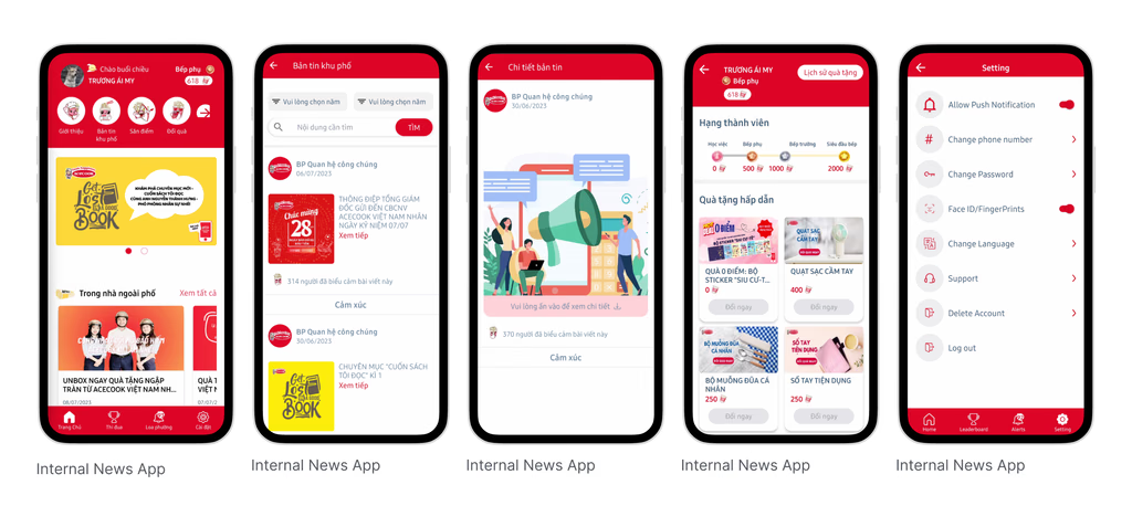
Homepage: make the first screen worth opening
Problem: The old homepage was empty. Nothing told people what mattered today.
What changed:
Shortcuts to key actions, front and center
Simpler, more consistent visuals
Latest news pulled straight to the top
Banners for ongoing internal events
Why this works: The homepage now answers one question fast: what's new, what matters, what to do next.
News feed: make updates easy to scan, not skip
Problem: Internal news was cluttered and hard to follow, causing important updates to be easily overlooked.
What changed:
Card layout with clear visual hierarchy
Lightweight reactions, so engaging takes one tap
Short previews, so people choose what to open without opening every post
A familiar feed layout, kept deliberately simple so factory-floor employees could pick it up without training
Why this works: Employees can scan, react, and catch key updates faster, reducing noise while keeping information accessible.
Engagement: turn small actions into a habit
Problem: After checking information, employees had little motivation to keep exploring or return regularly.
What changed:
Points for everyday actions: reacting, quizzes, mini games
Monthly quizzes and games as the main way to earn points
Points redeemable for real rewards
A leaderboard, for anyone who likes to compete
Why this works: Small actions now add up to something. That's the pull that brings people back.
LAUNCH
Available on the App Store and Google Play.
Launched, and still getting updates for new events and features.

TAKEAWAY
The app is easier to use now, that's the whole point
Nobody opens an internal app because it looks good. They open it because it's easy, and because there's a reason to.
This version won't be the last one. The old app worked too, until it didn't. This one will hit the same wall eventually. The job right now was just to make it lighter to carry until then.

If I had more time
Show different people different things. Office staff and factory workers need different homepages. Right now everyone sees the same one.
See if the habit sticks. Points and mini games are exciting at first. The real test is whether people still care in six months.
If you'd like to see the full process, from early research to design refinements and motion prototypes, feel free to reach out. I usually walk through the detailed exploration during interviews or casual portfolio chats.
product
Acecook Home: App Redesign
PROJECT
Internal App
role
UI/UX Designer
Team of 2
TIMELINE
May–Dec 2023
8 months
SKILLS
Interaction Design
Visual Design
Why this project exists
The old app stopped being useful
Acecook's internal app no longer matched how employees actually worked. The fix wasn't just cleaning up usability. It was making an app people would choose to open every day.
RESEARCH
Acecook gave us research and a feature list, we verified it with our own audit
Acecook handed us existing research along with a list of features they wanted, similar to a brief. Office employees opened the app regularly. Factory-floor employees barely did. Acecook wanted that gap closed, not just the interface polished.
We didn't stop there. We ran our own audit of the app and talked to a handful of users directly, enough to check Acecook's findings against what we saw ourselves.
What we intentionally did not do
We built on what already existed instead of starting over
No new research
We used Acecook's existing reports and let real context guide decisions instead of starting from zero.
No full flow redesign
Factory-floor employees don't have time to relearn an app. A full redesign would have cost more in training than it gained in polish.
No new features
We made what already existed easier to find and easier to trust. A lighter app beats a fuller one nobody opens.
INSIGHTS
Homepage, news, engagement, all missing the same thing
After the audit, we found three problems worth solving.
The homepage gave people no reason to open it daily. It looked the same whether something had changed or not.
News was a wall of text. Updates got lost in it, and people stopped scrolling past the first few posts.
Nothing brought people back. Once they checked in, there was no next action, no reward, no pull to open the app again.
Solution highlights
Homepage: make the first screen worth opening
Problem: The old homepage was empty. Nothing told people what mattered today.
What changed:
Shortcuts to key actions, front and center
Simpler, more consistent visuals
Latest news pulled straight to the top
Banners for ongoing internal events
Why this works: The homepage now answers one question fast: what's new, what matters, what to do next.
News feed: make updates easy to scan, not skip
Problem: Internal news was cluttered and hard to follow, causing important updates to be easily overlooked.
What changed:
Card layout with clear visual hierarchy
Lightweight reactions, so engaging takes one tap
Short previews, so people choose what to open without opening every post
A familiar feed layout, kept deliberately simple so factory-floor employees could pick it up without training
Why this works: Employees can scan, react, and catch key updates faster, reducing noise while keeping information accessible.
Engagement: turn small actions into a habit
Problem: After checking information, employees had little motivation to keep exploring or return regularly.
What changed:
Points for everyday actions: reacting, quizzes, mini games
Monthly quizzes and games as the main way to earn points
Points redeemable for real rewards
A leaderboard, for anyone who likes to compete
Why this works: Small actions now add up to something. That's the pull that brings people back.
LAUNCH
Available on the App Store and Google Play.
Launched, and still getting updates for new events and features.
TAKEAWAY
The app is easier to use now, that's the whole point
Nobody opens an internal app because it looks good. They open it because it's easy, and because there's a reason to.
This version won't be the last one. The old app worked too, until it didn't. This one will hit the same wall eventually. The job right now was just to make it lighter to carry until then.
If I had more time
Show different people different things. Office staff and factory workers need different homepages. Right now everyone sees the same one.
See if the habit sticks. Points and mini games are exciting at first. The real test is whether people still care in six months.
If you'd like to see the full process, from early research to design refinements and motion prototypes, feel free to reach out. I usually walk through the detailed exploration during interviews or casual portfolio chats.
thucxdoan@gmail.com
Updated Aug 1, 2026