
back
Context
Overview
Design Principles
Visual Direction
Design
Outcome
Final Thought
Website
Bentley Designs: A Digital Showroom
PROJECT
Furniture E-commerce Website
TIMELINE
Sep–Nov 2023
3 months
ROLE
UI/UX Designer
Team of 3
SKILLS
E-commerce Design
Interaction Design
Visual Design
Context
Bentley Designs sells furniture built to last. The website needed to feel that way too.
Bentley Designs is a British furniture company rebranding for the Vietnamese market: a full package from logo, to brand guideline, to brand visual, to brand identity. Another team delivered the brand guideline. Our team's part was the website, building on the direction and gu that had already been set.
Although the website was not ultimately launched, permission was granted to showcase the design work as part of this portfolio.
Design Principles
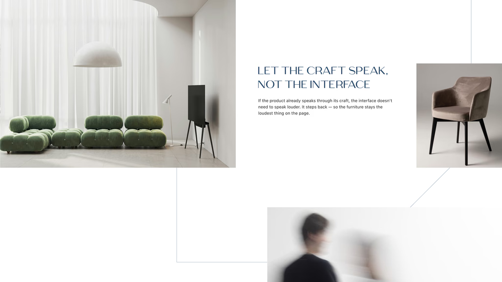
Let the craft speak, not the interface
A round of research across other furniture brands online made one thing clear: the ones that felt premium got quiet, and the ones that tried hardest to impress usually felt the cheapest.
What matters on a Bentley Designs piece is the material, the proportion, how it's put together, not whatever's trending. If the product already speaks for itself, the interface doesn't need to speak louder. Its job is to step back: no heavy styling, no visual noise, nothing pulling focus away from the piece itself.
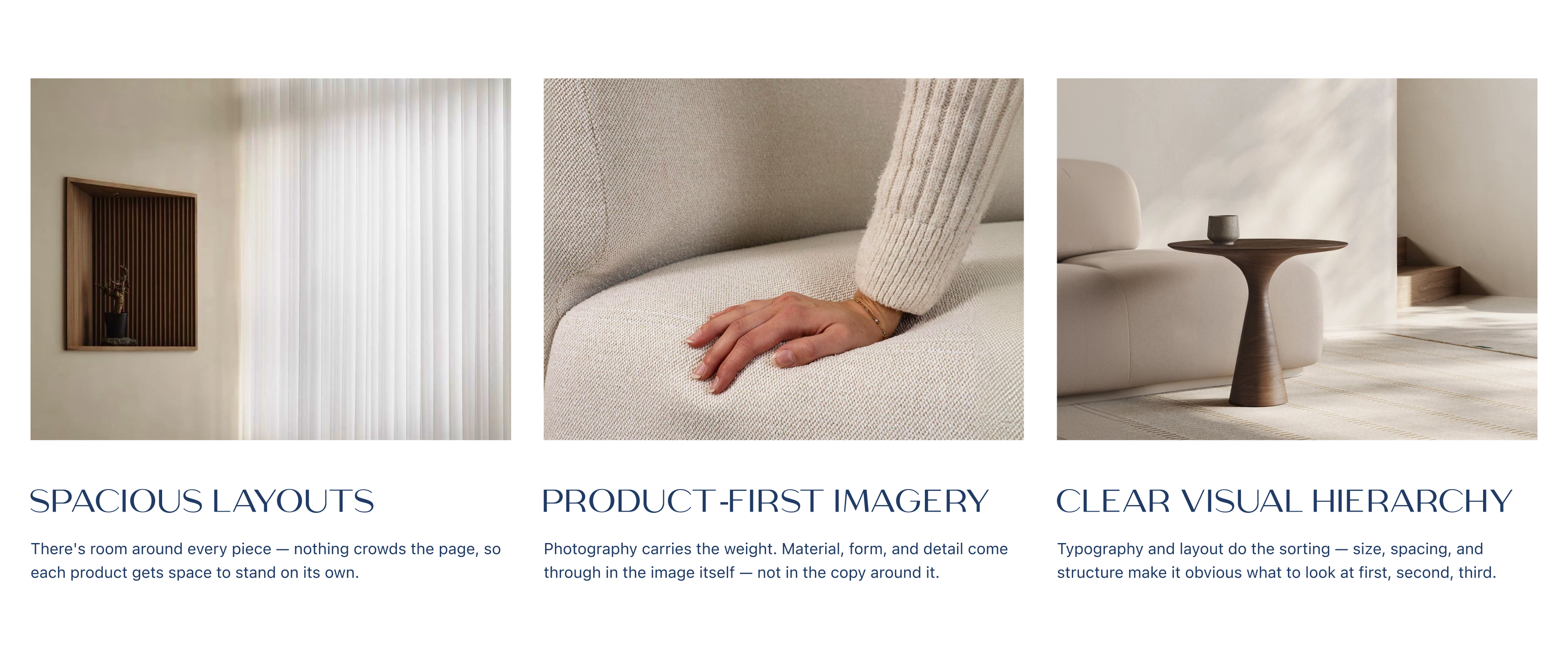
Three decisions carried that idea through the site:
Visual direction
The guideline was a start, not an answer
There was already a brand guideline, but applying it to a real interface meant answering questions the guideline never covered. Fonts stayed as they were. Layout was built from scratch.
The logo became the starting point for a visual treatment that shows up across the site as a decorative accent, not just a mark in the corner.

DESIGN
The homepage was designed to be a digital showroom to explore
The homepage was the first thing designed, and it went through the most rounds. Getting Bentley's design spirit to actually come through on screen took a while to land, several passes before it felt right.
Like walking into a showroom, just digital.


Overall, the homepage leans entirely on imagery, collections, and the furniture itself to carry the mood.
From listing to detail
While the homepage sets the mood, this part is about helping people choose.
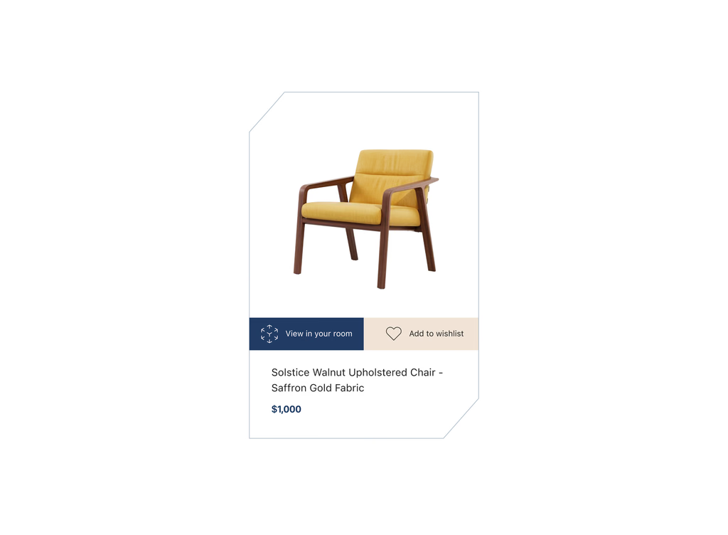
A plain white card is fast to scan, but it doesn't tell you much about how a piece would actually feel in your space. So on hover, the product moves into a real room: the scene changes, a frame appears, carrying the brand logo alongside two quick actions, view in 3D and add to wishlist.


The product detail page follows the same idea: space to breathe, a simple price and detail layout, and imagery that sets the mood.


The other side of the site
Same visual language, different purpose: telling the brand's story.
About Us, Sustainability, Inspiration, and Careers don't sell anything. They follow the same art direction as the rest of the site, but the job here is to build trust: showing who Bentley is, not just what it makes.


OUTCOME
The flow got built without cutting the brand out of it
The result is a complete flow that holds up on its own: listing, product detail, checkout, all moving logically from one to the next. And through every step, Bentley's craft-first identity never gets lost. Neither side had to be sacrificed for the other.
FINAL THOUGHTS
REFLECTION
Working within a direction that was already set taught me something: the craft isn't in inventing, it's in holding an idea steady across every screen without letting it drift.
If you'd like to see the full process, from early research to design refinements and motion prototypes, feel free to reach out. I usually walk through the detailed exploration during interviews or casual portfolio chats.
Website
Bentley Designs: A Digital Showroom
PROJECT
Furniture E-commerce Website
ROLE
UI/UX Designer
Team of 3
TIMELINE
Sep–Nov 2024
3 months
SKILLS
E-commerce Design
Interaction Design
Visual Design
Context
Bentley Designs sells furniture built to last. The website needed to feel that way too.
Bentley Designs is a British furniture company rebranding for the Vietnamese market: a full package from logo, to brand guideline, to brand visual, to brand identity. Another team delivered the brand guideline. Our team's part was the website, building on the direction and gu that had already been set.
Although the website was not ultimately launched, permission was granted to showcase the design work as part of this portfolio.
Design Principles
Let the craft speak, not the interface
A round of research across other furniture brands online made one thing clear: the ones that felt premium got quiet, and the ones that tried hardest to impress usually felt the cheapest.
What matters on a Bentley Designs piece is the material, the proportion, how it's put together, not whatever's trending. If the product already speaks for itself, the interface doesn't need to speak louder. Its job is to step back: no heavy styling, no visual noise, nothing pulling focus away from the piece itself.
Three decisions carried that idea through the site:
Visual direction
The guideline was a start, not an answer
There was already a brand guideline, but applying it to a real interface meant answering questions the guideline never covered. Fonts stayed as they were. Layout was built from scratch.
The logo became the starting point for a visual treatment that shows up across the site as a decorative accent, not just a mark in the corner.
DESIGN
The homepage was designed to be a digital showroom to explore
The homepage was the first thing designed, and it went through the most rounds. Getting Bentley's design spirit to actually come through on screen took a while to land, several passes before it felt right.
Like walking into a showroom, just digital.
Overall, the homepage leans entirely on imagery, collections, and the furniture itself to carry the mood.
From listing to detail
While the homepage sets the mood, this part is about helping people choose.
A plain white card is fast to scan, but it doesn't tell you much about how a piece would actually feel in your space. So on hover, the product moves into a real room: the scene changes, a frame appears, carrying the brand logo alongside two quick actions, view in 3D and add to wishlist.
The product detail page follows the same idea: space to breathe, a simple price and detail layout, and imagery that sets the mood.
The other side of the site
Same visual language, different purpose: telling the brand's story.
About Us, Sustainability, Inspiration, and Careers don't sell anything. They follow the same art direction as the rest of the site, but the job here is to build trust: showing who Bentley is, not just what it makes.
OUTCOME
The flow got built without cutting the brand out of it
The result is a complete flow that holds up on its own: listing, product detail, checkout, all moving logically from one to the next. And through every step, Bentley's craft-first identity never gets lost. Neither side had to be sacrificed for the other.
FINAL THOUGHTS
REFLECTION
Working within a direction that was already set taught me something: the craft isn't in inventing, it's in holding an idea steady across every screen without letting it drift.
If you'd like to see the full process, from early research to design refinements and motion prototypes, feel free to reach out. I usually walk through the detailed exploration during interviews or casual portfolio chats.
thucxdoan@gmail.com
Updated Aug 1, 2026