
back
Context
Brand strategy
Key decisions
The visual system
Where the system was applied
Final Thoughts
IDENTITY
Agent Lunar: Fun tech brand system for a SaaS Marketing Tool
PROJECT
Personal project
TIMELINE
1 month
October 2025
role
Designer
Team of 2
SKILLS
Brand Identity
Visual Design
Marketing Collateral
Context
Built fast for a real startup pitch
Agent Lunar is a marketing tool for SME teams. Before the investor pitch, the product was still being built, and there was no visual identity to speak of. The goal was to create a brand system fast enough to carry the pitch deck, landing page, and demo, while still being something the team could grow into.
The real problem
Must stand out
Must stand out
Even under time pressure, the brand still needed a recognisable look instead of blending into the common SaaS style.
No time for exploration
No time for exploration
The brand had to be defined quickly, without long visual exploration or multiple concept rounds.
Must be usable immediately
Must be usable immediately
The system had to work right away for the investor pitch: deck, landing page, and demo, not as a future concept.
Brand strategy
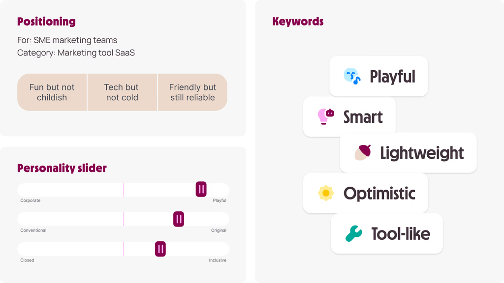
Before moving into visuals, the brand needed a personality specific enough to guide daily decisions, not a vague adjective on a slide but a clear position on each opposing axis.
Key decisions
Decision 1: Intentionally choose a “Fun Tech” direction
Most SaaS brands at the time played it safe. We chose to go approachable and optimistic, playful tone, but clean and tool-like in structure. Memorable in the pitch room, less intimidating for SME users. From there, we locked a moodboard to carry that direction into the next stage.

Decision 2: Lock the logo early and move fast
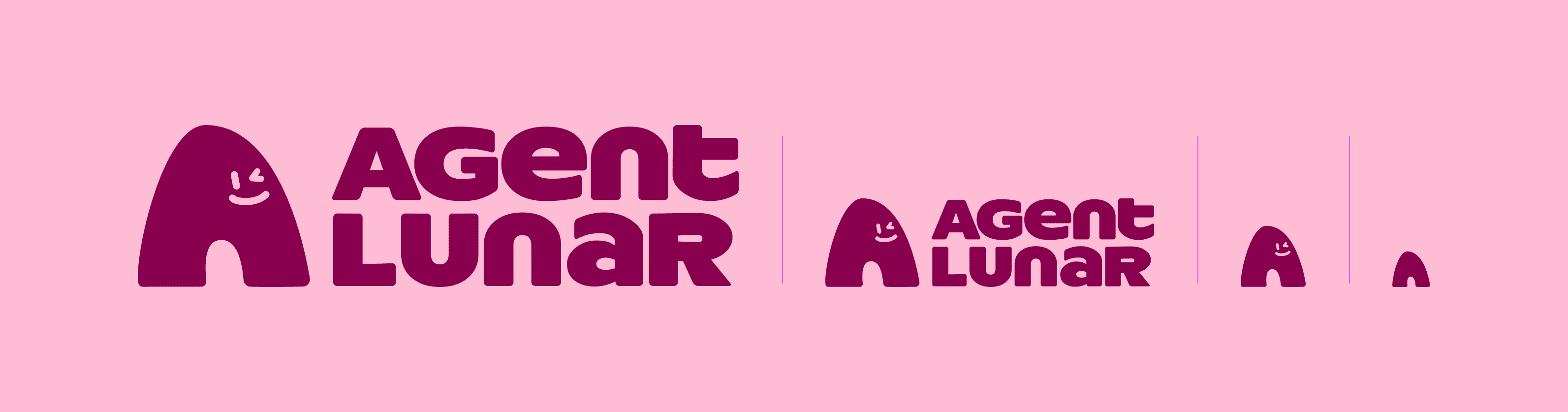
The logo concept centers on a mascot paired with an 'A' logomark, using a monocase typeface to feel friendly without losing a modern edge. It wasn't ideal, but debating it would've blocked everything else. We agreed the logo isn't everything, so we accepted it and spent the time building out the identity system instead. In exchange, we kept its usage small to avoid scrutiny.

Decision 3: Build a system based on simple, repeatable graphic blocks
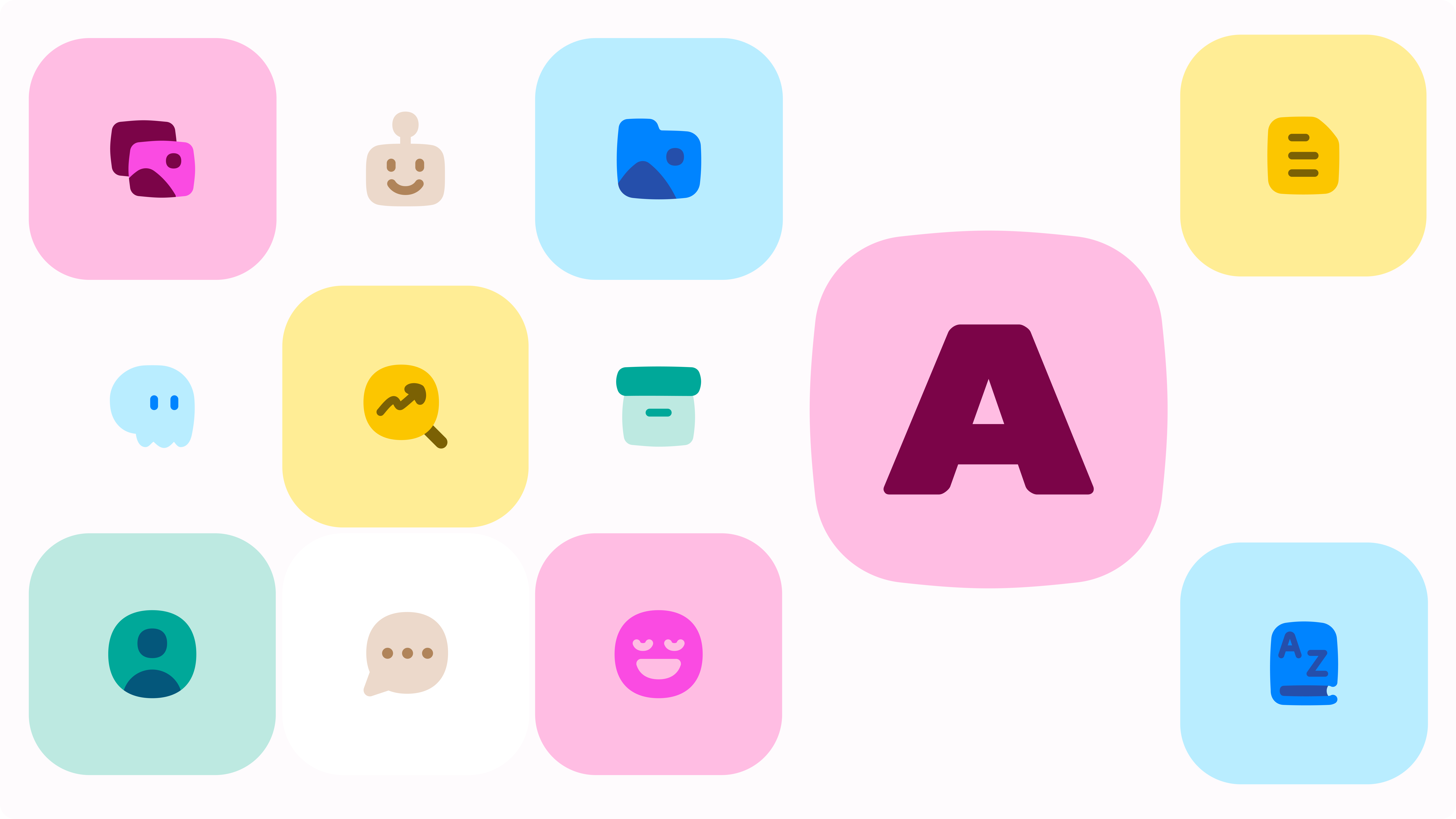
After a few rounds of research and testing, we settled on the fastest way to build a system within a tight timeline: a small set of shapes, illustration styles, and layout patterns, designed to recombine. Fast to produce, easy to extend across deck, landing page, and UI. We traded premium detail for scalability.

The visual system
Each decision became something visible.
Each visual element was chosen to carry the personality and constraints defined above.
Typography
Friendly and modern — readable in a deck, distinct enough to avoid the SaaS-bland look
Color
Slightly bold palette — avoids the default SaaS neutral
Illustration
Simple graphic blocks that are fast to produce and instantly recognisable as Lunar's
Layout logic
Built by combining the visual decisions above into a system that feels clean, open, and easy to scan.

Where the system was applied
Pitch deck first, then everything else.
All the visual decisions, type, color, layout blocks, were defined beforehand. But the pitch deck was where we found out what actually worked. It didn't come together on the first try. We adjusted, sometimes significantly, until it matched what we'd visualized. That trial-and-error process is what made the system actually work.


FINAL THOUGHTS
If I had more time
Extend system into full UI kit
Build motion / micro-interactions
Test with real SME users
What I learned
Branding for startup is about speed + clarity, not perfection
A system > a logo
Constraint is a design material
If you'd like to see the full process, from early research to design refinements and motion prototypes, feel free to reach out. I usually walk through the detailed exploration during interviews or casual portfolio chats.
IDENTITY
Agent Lunar: Fun tech brand system for a SaaS Marketing Tool
PROJECT
Personal project
role
Designer
Team of 2
TIMELINE
1 month
October 2025
SKILLS
Brand Identity
Visual Design
Marketing Collateral
Context
Built fast for a real startup pitch
Agent Lunar is a marketing tool for SME teams. Before the investor pitch, the product was still being built, and there was no visual identity to speak of. The goal was to create a brand system fast enough to carry the pitch deck, landing page, and demo, while still being something the team could grow into.
The real problem
Must stand out
Even under time pressure, the brand still needed a recognisable look instead of blending into the common SaaS style.
No time for exploration
The brand had to be defined quickly, without long visual exploration or multiple concept rounds.
Must be usable immediately
The system had to work right away for the investor pitch: deck, landing page, and demo, not as a future concept.
Brand strategy
Before moving into visuals, the brand needed a personality specific enough to guide daily decisions, not a vague adjective on a slide but a clear position on each opposing axis.
Key decisions
Decision 1: Intentionally choose a “Fun Tech” direction
Most SaaS brands at the time played it safe. We chose to go approachable and optimistic, playful tone, but clean and tool-like in structure. Memorable in the pitch room, less intimidating for SME users. From there, we locked a moodboard to carry that direction into the next stage.
Decision 2: Lock the logo early and move fast
The logo concept centers on a mascot paired with an 'A' logomark, using a monocase typeface to feel friendly without losing a modern edge. It wasn't ideal, but debating it would've blocked everything else. We agreed the logo isn't everything, so we accepted it and spent the time building out the identity system instead. In exchange, we kept its usage small to avoid scrutiny.
Decision 3: Build a system based on simple, repeatable graphic blocks
After a few rounds of research and testing, we settled on the fastest way to build a system within a tight timeline: a small set of shapes, illustration styles, and layout patterns, designed to recombine. Fast to produce, easy to extend across deck, landing page, and UI. We traded premium detail for scalability.
The visual system
Each decision became something visible.
Each visual element was chosen to carry the personality and constraints defined above.
Typography
Friendly and modern — readable in a deck, distinct enough to avoid the SaaS-bland look
Color
Slightly bold palette — avoids the default SaaS neutral
Illustration
Simple graphic blocks that are fast to produce and instantly recognisable as Lunar's
Layout logic
Built by combining the visual decisions above into a system that feels clean, open, and easy to scan.
Where the system was applied
Pitch deck first, then everything else.
All the visual decisions, type, color, layout blocks, were defined beforehand. But the pitch deck was where we found out what actually worked. It didn't come together on the first try. We adjusted, sometimes significantly, until it matched what we'd visualized. That trial-and-error process is what made the system actually work.
FINAL THOUGHTS
If I had more time
Extend system into full UI kit
Build motion / micro-interactions
Test with real SME users
What I learned
Branding for startup is about speed + clarity, not perfection
A system > a logo
Constraint is a design material
If you'd like to see the full process, from early research to design refinements and motion prototypes, feel free to reach out. I usually walk through the detailed exploration during interviews or casual portfolio chats.
thucxdoan@gmail.com
Updated Aug 1, 2026