back
Overview
Context
Design Principles
Visual direction
Shortcut
product
VNUHCM Libraries — Redesigning the App I Used Every Day
PROJECT
Personal project
TIMELINE
1 month
October 2025
role
Solo Designer
SKILLS
Product Thinking
Interaction Design
Visual Design
MOTIVATION
A personal project with a real reason behind it
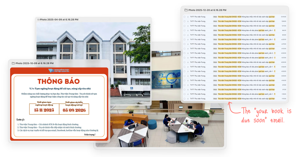
I've been going to this library since 2021, regularly enough to be recognized as one of the most active borrowers that year. When the library announced a major renovation, I saw an opportunity to do the same for the app. This project started from wanting to give something back to a place that has been part of my life for three years.
WHAT I FOUND
The original app worked, but felt outdated and difficult to navigate.
The issues below became the starting point for the redesign. They come from reviewing the current app and my own experience using it over time.
NO PRIVACY ON HOME
The homepage displayed the library card and personal details openly, visible to anyone nearby every time the app was opened.
NO FILTERS IN SEARCH
Search lacked filtering and clear browsing patterns, making it harder to find and locate books across the library system.
NO IN-APP RENEWAL
Renewal existed in the app but was buried and confusing enough that most students gave up and went to the website instead.

Design Goals
The issues above helped define three principles that guided the redesign.

CLARITY OVER COMPLEXITY
Every screen should make sense at first glance, no learning curve.

Keep it simple
Core actions should be reachable in two taps or less.

FRIENDLY BY DEFAULT
The interface should feel welcoming and easy to use, rather than formal and institutional.
insight + key features
1. The homepage needed a clearer role
Instead of asking what to add, I started by asking what the homepage should actually do.
Before
The homepage was optimized for one task: accessing the library card. Everything else students came back for was treated as secondary.
After
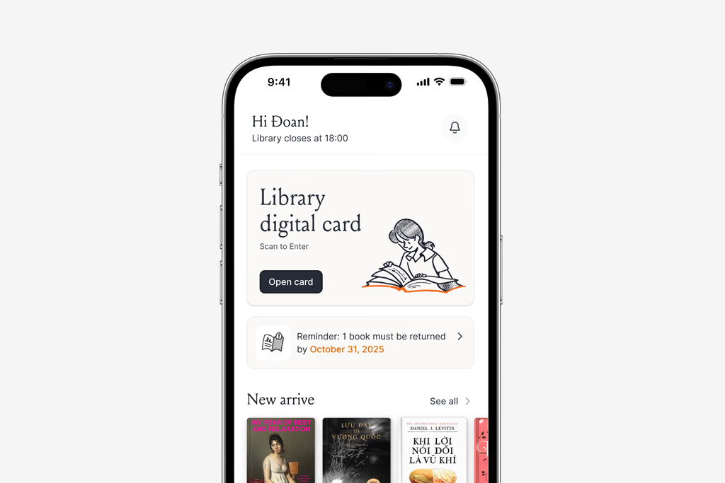
The homepage now prioritizes due dates, borrowing activity, and new arrivals, while keeping the library card just one tap away.

2. Made search easier with familiar patterns
Instead of reinventing search, I built on patterns students already knew from the library website and other apps they use every day.
Helping students narrow results faster
Before
The app could search for books, but without filters it was difficult to narrow results, so many students switched to the website instead.
After
The redesigned search introduces familiar filters for title, author, keyword, and ISBN, making it easier to refine results without learning a new search experience.

Book details organized around two tasks.
The detail screen supports two different tasks: understanding the book and finding an available copy. Separating Book Info from Status & Location makes the information easier to navigate without adding anything new.

Brought library management into one place
The app brings together renewals, borrowing history, saved books, and collections into one connected experience. Students can manage their library activity in one place, with highlighted due dates making upcoming deadlines easier to notice.

VISUAL DESICION
Simplifying the interface to let books become the visual focus
The interface stays intentionally minimal so the books can do most of the visual work. Book covers already bring their own color and personality, so the UI steps back instead of competing for attention.
A restrained palette of black, white, warm gray, and orange keeps the experience calm while still highlighting important actions and reminders.

Adding warmth through illustrations
Minimal illustrations introduce personality without overwhelming the interface. The same visual language extends across icons, empty states, and supporting graphics, making the product feel more approachable while preserving its minimal aesthetic.

prototype
Outcome
The redesign shifts the app from a simple library card into a tool that supports the entire borrowing journey. Students can discover books more easily, keep track of library activity, and manage common tasks without relying on the website.
Since this is a personal redesign, these decisions are based on an interface audit and my own experience using the app. The next step would be validating them with real users before moving into implementation.

FINAL THOUGHTS
NEXT STEP
Testing the redesigned flows with real students across different library branches.
REFLECTION
Most improvements came from simplifying existing flows instead of adding new features.
If you'd like to see the full process, from early research to design refinements and motion prototypes, feel free to reach out. I usually walk through the detailed exploration during interviews or casual portfolio chats.
product
VNUHCM Libraries — Redesigning the App I Used Every Day
PROJECT
Personal project
role
Solo Designer
TIMELINE
1 month
October 2025
SKILLS
Product Thinking
Interaction Design
Visual Design
MOTIVATION
A personal project with a real reason behind it
I've been going to this library since 2021, regularly enough to be recognized as one of the most active borrowers that year. When the library announced a major renovation, I saw an opportunity to do the same for the app. This project started from wanting to give something back to a place that has been part of my life for three years.
WHAT I FOUND
The original app worked, but felt outdated and difficult to navigate.
The issues below became the starting point for the redesign. They come from reviewing the current app and my own experience using it over time.
NO PRIVACY ON HOME
The homepage displayed the library card and personal details openly, visible to anyone nearby every time the app was opened.
NO FILTERS IN SEARCH
Search lacked filtering and clear browsing patterns, making it harder to find and locate books across the library system.
NO IN-APP RENEWAL
Renewal existed in the app but was buried and confusing enough that most students gave up and went to the website instead.
Design Goals
The issues above helped define three principles that guided the redesign.
CLARITY OVER COMPLEXITY
Every screen should make sense at first glance, no learning curve.
Keep it simple
Core actions should be reachable in two taps or less.
FRIENDLY BY DEFAULT
The interface should feel welcoming and easy to use, rather than formal and institutional.
insight + key features
1. The homepage needed a clearer role
Instead of asking what to add, I started by asking what the homepage should actually do.
Before
The homepage was optimized for one task: accessing the library card. Everything else students came back for was treated as secondary.
After
The homepage now prioritizes due dates, borrowing activity, and new arrivals, while keeping the library card just one tap away.
2. Made search easier with familiar patterns
Instead of reinventing search, I built on patterns students already knew from the library website and other apps they use every day.
Helping students narrow results faster
Before
The app could search for books, but without filters it was difficult to narrow results, so many students switched to the website instead.
After
The redesigned search introduces familiar filters for title, author, keyword, and ISBN, making it easier to refine results without learning a new search experience.
Book details organized around two tasks.
The detail screen supports two different tasks: understanding the book and finding an available copy. Separating Book Info from Status & Location makes the information easier to navigate without adding anything new.
Brought library management into one place
The app brings together renewals, borrowing history, saved books, and collections into one connected experience. Students can manage their library activity in one place, with highlighted due dates making upcoming deadlines easier to notice.
VISUAL DESICION
Simplifying the interface to let books become the visual focus
The interface stays intentionally minimal so the books can do most of the visual work. Book covers already bring their own color and personality, so the UI steps back instead of competing for attention.
A restrained palette of black, white, warm gray, and orange keeps the experience calm while still highlighting important actions and reminders.
Adding warmth through illustrations
Minimal illustrations introduce personality without overwhelming the interface. The same visual language extends across icons, empty states, and supporting graphics, making the product feel more approachable while preserving its minimal aesthetic.
prototype
Outcome
The redesign shifts the app from a simple library card into a tool that supports the entire borrowing journey. Students can discover books more easily, keep track of library activity, and manage common tasks without relying on the website.
Since this is a personal redesign, these decisions are based on an interface audit and my own experience using the app. The next step would be validating them with real users before moving into implementation.
FINAL THOUGHTS
NEXT STEP
Testing the redesigned flows with real students across different library branches.
REFLECTION
Most improvements came from simplifying existing flows instead of adding new features.
If you'd like to see the full process, from early research to design refinements and motion prototypes, feel free to reach out. I usually walk through the detailed exploration during interviews or casual portfolio chats.
thucxdoan@gmail.com
Updated Aug 1, 2026